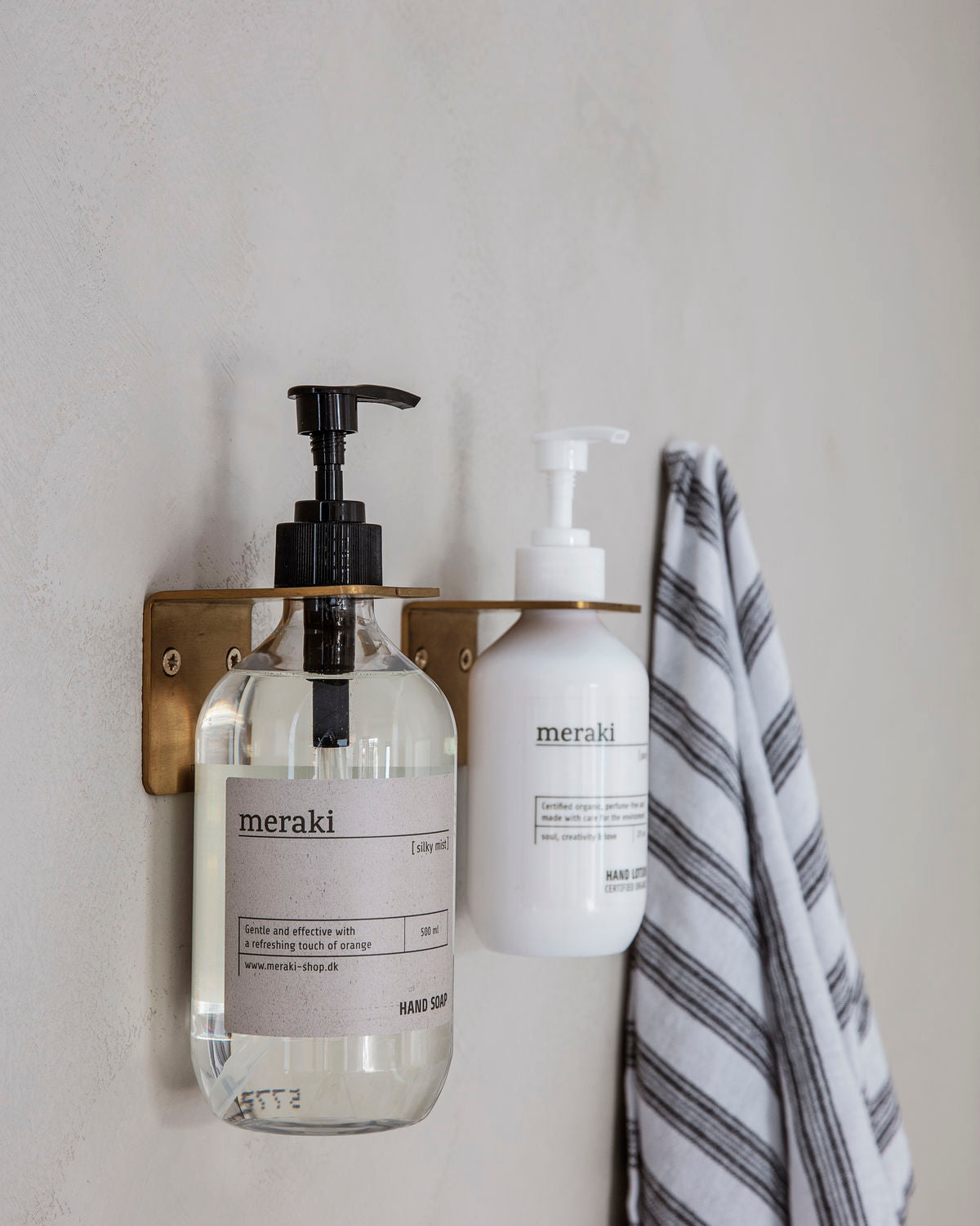
Japandi style, the harmonious blend of Japanese minimalism and Scandinavian coziness, continues to shape interior design in 2026. This year’s palette is all about muted, nature-inspired tones that evoke calm, balance, and timeless elegance. Here are the five standout colors for Japandi interiors in 2026, with ideas for how to use them in your home.
1. Warm White
Why it works:
Warm white is the foundation of Japandi interiors. It creates a sense of spaciousness, purity, and light, while feeling softer and more welcoming than stark white. This shade is perfect for walls, ceilings, and large furniture, providing a serene backdrop for natural materials and subtle contrasts.
How to use it:
- Paint walls and ceilings in warm white to open up the space.
- Pair with light wood, linen, and stone for a tranquil, airy feel.
- Use as a base for layering other Japandi colors.
Paint inspiration:
2. Stone Gray
Why it works:
Stone gray brings quiet depth and sophistication to Japandi spaces. It’s a calming neutral that pairs beautifully with both warm and cool tones, and it echoes the natural stone and concrete often found in Japanese and Scandinavian design.
How to use it:
- Use for accent walls, cabinetry, or textiles.
- Combine with warm whites and wood for a balanced, layered look.
- Try stone gray tiles or paint in bathrooms and kitchens for a spa-like vibe.
Paint inspiration:
- “Set in Stone” by Clare
- “Gray Owl” by Benjamin Moore
- “Ghost Town Quarter” by Dulux [18 Japandi...The Spruce]
3. Sage Green
Why it works:
Sage green is the go-to accent for 2026 Japandi interiors. This muted, earthy green brings a sense of nature indoors, promoting relaxation and harmony. It’s subtle enough to act as a neutral, yet distinct enough to add character.
How to use it:
- Paint a feature wall or ceiling in sage green.
- Add sage green cushions, throws, or ceramics.
- Pair with beige, taupe, and natural wood for a fresh, organic palette.
Paint inspiration:
4. Soft Terracotta
Why it works:
Soft terracotta introduces warmth and a touch of earthiness to Japandi spaces. This gentle, clay-inspired hue is perfect for adding depth and coziness without overpowering the minimalist aesthetic.
How to use it:
- Use on accent walls, pottery, or textiles.
- Combine with warm whites and stone gray for a balanced look.
- Try terracotta planters or lamps for subtle pops of color.
Paint inspiration:
5. Greige (Gray-Beige)
Why it works:
Greige—a blend of gray and beige—is the ultimate Japandi neutral. It’s versatile, understated, and works with virtually any other color in the palette. Greige grounds the space, making it feel cozy yet uncluttered.
How to use it:
- Paint kitchen cabinets or bedroom walls in greige.
- Layer with soft whites, sage green, and natural wood.
- Use greige textiles (rugs, curtains, bedding) for a cohesive, calming effect.
Paint inspiration:
Japandi Styling Tips for 2026
- Layer textures: Combine linen, wool, wood, and ceramics for depth and warmth.
- Keep it simple: Limit your palette to 3–5 colors for a harmonious look.
- Embrace nature: Use plants, stone, and wood to reinforce the connection to the outdoors.
- Contrast subtly: Add touches of black or charcoal for definition, but keep the overall mood soft and balanced.
Conclusion
The Japandi palette for 2026 is all about muted, nature-inspired colors that create a peaceful, timeless home. By focusing on warm whites, stone gray, sage green, soft terracotta, and greige, you’ll achieve a look that’s both modern and deeply rooted in tradition.